


One of my most frequently asked questions deals with paint colors that coordinate well with wood trim and cabinets. Today, that is what we are going to talk about! Most of the pictures that are submitted and posted on this site have painted white trim or cabinets, which I think looks clean, crisp and makes the paint pop – I love white, but not everyone has white cabinets or trim, or even wants them, or maybe you do want them but you have a stubborn husband or landlord. So if you have any type of wood in your home and are trying to pick out a paint color to go with it, this post is for you!

I know there are a lot of different opinions and tastes on what goes with wood and what doesn’t, but when picking out paint colors – I would leave wood in it’s natural element. Think earth tones and neutrals. That’s what God put wood with in nature and I would leave it that way in your home. I would try and avoid bright colors, especially yellows. The two will clash and there won’t be a harmonious feel.
If you have darker wood, I would definitely choose a lighter color, something that will provide contrast and showcase the trim – because that can be art in itself.
For lighter woods, go a little darker, once again to provide contrast.
If you have Honey Oak, or “orange” oak in your home, and really any type of wood, you will have to determine if you want your cabinets or trim to stand out and “pop”, or if you want your paint color to blend with the oak. If you want it to stand out, picking a cool paint color will give the paint and the oak a distinct contrast. Go with the purple, blue or green family.
Warmer paint colors, from the red, orange and gold family, will create a welcoming feel and will give your room more of a glow.
If you go with neutral colors, which I would most definitely recommend, you have the ability to not only create a harmonious feel between the paint and the wood, but you can add color elsewhere when you decorate. Neutral colors are meant to compliment just about anything, so you won’t have to worry about other colors in your home clashing with the paint.
So below I have listed some of my favorite neutrals. Colors that I believe will compliment the wood in your home. These are meant to provide a starting point for you. Not every color will look good on your walls. Every home has different lighting, home décor and colors in general so what may look good on my walls might look terrible on yours. Just make sure to sample – that will give you the best idea of how the paint will truly look.
Another tip – most every paint brand (Benjamin Moore, Martha Stewart, Sherwin Williams, etc.) has a nuetral section that you can find in their fan decks or at the actual store, with a variety of colors to choose from. That would be another great place to start if you want more choices than the ones listed below.
Here are my favorite nuetrals – many have been featured here at FPC and are colors that I would use if I were to paint my home today. This is where I would start.
Hush by Benjamin Moore | China Doll by Sherwin Williams | Ancient Marble by SW |
Gray Owl by BM
| Consentino Chardonnay by BM | Upward by SW |
Universal Khaki by SW | Blonde by SW | Revere Pewter by BM |
Oat Straw by Behr | Rice Grain by SW | |
Fossil by SW | Nutshell by Martha Stewart | Pebble by Martha Stewart |
Cityscape by Martha Stewart | Kilim Beige by SW | Softened Green by SW |
I have also included more photos of inspiration, to give you an idea of what certain colors may look like against wood.

Latte by Sherwin-Williams

White Raisin by Sherwin Williams

*not sure of the exact paint color name, but added it for inspiration. love the gray here with the wood trim. for more info click on the link below.*
Design Sponge
Design Sponge

Manchester Tan by Benjamin Moore. Another one of my favorite neutrals. See more here.
Tobacco Road by Duron

Tobacco Road again– see more here

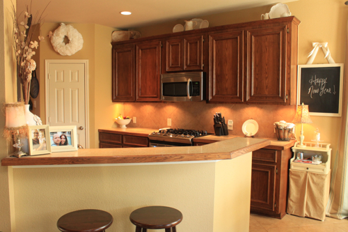
Cliff Rock by Behr
From my cute sis-in-law’s house.

Cliff Rock again in the kitchen.

Spring Fawn by ColorPlace
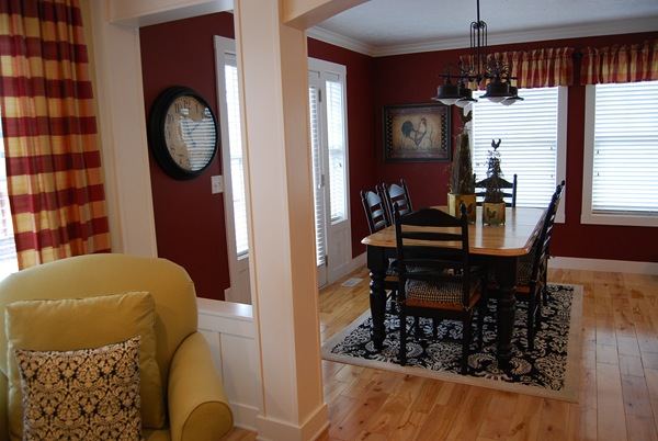
Bing Cherry by Porter Paint. I showed this because of the light wood floors.

Betsy Ross House Moss by Valspar (National Trust Historic paint collection). Once again, I love this color with the wood floors.

Grasslands by SW - Garden Web
")
Tate Olive by Benjamin Moore
*I scanned this from the “Pacific Northwest” pamphlet from Benjamin Moore.

Revere Pewter by Benjamin Moore.
*I scanned this one too, taken from the “timeless neutrals” pamphlet from BM. You can barely notice wood trim on the bottom, but I loved it with the table and chairs too.

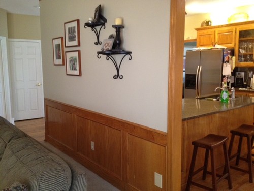
Neutral with Oak
I would love to see the paint colors you have chosen to go with the wood in your home. If you have a paint color that you love, please send me your pictures and I will try to add them to this post. If you have additional questions, don’t hesitate to comment or e-mail me at favoritepaintcolors@gmail.com. Have a wonderful weekend everyone and Happy Painting!