


One of my most frequently asked questions deals with paint colors that coordinate well with wood trim and cabinets. Today, that is what we are going to talk about! Most of the pictures that are submitted and posted on this site have painted white trim or cabinets, which I think looks clean, crisp and makes the paint pop – I love white, but not everyone has white cabinets or trim, or even wants them, or maybe you do want them but you have a stubborn husband or landlord. So if you have any type of wood in your home and are trying to pick out a paint color to go with it, this post is for you!

I know there are a lot of different opinions and tastes on what goes with wood and what doesn’t, but when picking out paint colors – I would leave wood in it’s natural element. Think earth tones and neutrals. That’s what God put wood with in nature and I would leave it that way in your home. I would try and avoid bright colors, especially yellows. The two will clash and there won’t be a harmonious feel.
If you have darker wood, I would definitely choose a lighter color, something that will provide contrast and showcase the trim – because that can be art in itself.
For lighter woods, go a little darker, once again to provide contrast.
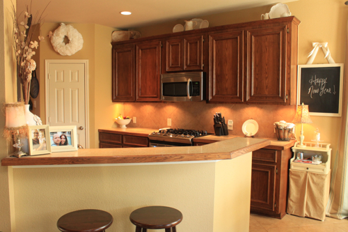
If you have Honey Oak, or “orange” oak in your home, and really any type of wood, you will have to determine if you want your cabinets or trim to stand out and “pop”, or if you want your paint color to blend with the oak. If you want it to stand out, picking a cool paint color will give the paint and the oak a distinct contrast. Go with the purple, blue or green family.
Warmer paint colors, from the red, orange and gold family, will create a welcoming feel and will give your room more of a glow.
If you go with neutral colors, which I would most definitely recommend, you have the ability to not only create a harmonious feel between the paint and the wood, but you can add color elsewhere when you decorate. Neutral colors are meant to compliment just about anything, so you won’t have to worry about other colors in your home clashing with the paint.
So below I have listed some of my favorite neutrals. Colors that I believe will compliment the wood in your home. These are meant to provide a starting point for you. Not every color will look good on your walls. Every home has different lighting, home décor and colors in general so what may look good on my walls might look terrible on yours. Just make sure to sample – that will give you the best idea of how the paint will truly look.
Another tip – most every paint brand (Benjamin Moore, Martha Stewart, Sherwin Williams, etc.) has a nuetral section that you can find in their fan decks or at the actual store, with a variety of colors to choose from. That would be another great place to start if you want more choices than the ones listed below.
Here are my favorite nuetrals – many have been featured here at FPC and are colors that I would use if I were to paint my home today. This is where I would start.
Hush by Benjamin Moore | China Doll by Sherwin Williams | Ancient Marble by SW |
Gray Owl by BM
| Consentino Chardonnay by BM | Upward by SW |
Universal Khaki by SW | Blonde by SW | Revere Pewter by BM |
Oat Straw by Behr | Rice Grain by SW | |
Fossil by SW | Nutshell by Martha Stewart | Pebble by Martha Stewart |
Cityscape by Martha Stewart | Kilim Beige by SW | Softened Green by SW |
I have also included more photos of inspiration, to give you an idea of what certain colors may look like against wood.

Latte by Sherwin-Williams

White Raisin by Sherwin Williams

*not sure of the exact paint color name, but added it for inspiration. love the gray here with the wood trim. for more info click on the link below.*
Design Sponge
Design Sponge

Manchester Tan by Benjamin Moore. Another one of my favorite neutrals. See more here.
Tobacco Road by Duron

Tobacco Road again– see more here

Cliff Rock by Behr
From my cute sis-in-law’s house.

Cliff Rock again in the kitchen.

Spring Fawn by ColorPlace
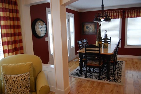
Bing Cherry by Porter Paint. I showed this because of the light wood floors.

Betsy Ross House Moss by Valspar (National Trust Historic paint collection). Once again, I love this color with the wood floors.

Grasslands by SW - Garden Web
")
Tate Olive by Benjamin Moore
*I scanned this from the “Pacific Northwest” pamphlet from Benjamin Moore.

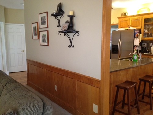
Revere Pewter by Benjamin Moore.
*I scanned this one too, taken from the “timeless neutrals” pamphlet from BM. You can barely notice wood trim on the bottom, but I loved it with the table and chairs too.

Neutral with Oak
I would love to see the paint colors you have chosen to go with the wood in your home. If you have a paint color that you love, please send me your pictures and I will try to add them to this post. If you have additional questions, don’t hesitate to comment or e-mail me at favoritepaintcolors@gmail.com. Have a wonderful weekend everyone and Happy Painting!


There are some great ideas in here. It's hard to find good inspiration photos with wood trim so thanks for pulling these together!
ReplyDeleteI go back and forth over whether or not I should paint my wood trim. My whole house and all the cabinets are wood and it would be SO much work to paint it all.
I think one of the reasons I don't like my wood trim is that it's so scuffed up and difficult to keep looking clean and beautiful. With white trim you can just freshen up old dings and paint marks with a new coat of paint. Do you have any suggestions for cleaning old paint smears off wood trim and just generally keeping it as clean and nice as it looks in some of those photos? If I could clean my trim up a bit, I might not dislike it so much. Thanks!
If I were you, I would go to a hardware store and ask someone there if they know what you can do to get rid of paint smears. I know magic erasers have worked great on my baseboards for scuffs and you can get minwax touchups that will match the stain of your wood. Or sanding and refinishing? I'm not sure how bad your smears are.
DeleteGreat post. I found out the hard way-trial and error. I painted my living room (full of wood trim) bright yellow hoping to brighten the space but it still managed to look dark.
ReplyDeleteMy laundry room has wood trim and I went with blue on the walls. http://www.designocd.com/2011/08/loads-of-fun/
And ironically I ended up going with dark paint in the living room and a light rug, and it looks so much brighter.
http://www.designocd.com/2011/08/the-room-that-started-it-all/
Wow, Jae! Both rooms look awesome! Your laundry room makeover is beautiful, and I love the blue with the wood. It's amazing that you went with darker paint in your living room and it actually lightened it up. I think it looks soo much better! Thanks for sharing - do you mind if I feature both rooms so everyone can see? Not sure if everyone will see it in the comments. Thanks! :)
DeleteNo problem. Thanks!
DeleteFinally, a post for those of us with natural wood. This was so helpful and timely, in my case. I have paint samples all over my home. They're sitting next to the wood in every possible light exposure. I have been looking to neutrals, as you suggested, and there are so many choices! I appreciated the photos. I am leaning toward Manchester Tan by BM. Your suggestion of BM's Hush also looks nice. I agree with the cool/warm paint theory. You verbalized a lot of the issues circling in my mind concerning that. Thanks for a very helpful post!
ReplyDeleteSo glad it helped! I love BM Manchester Tan, but I also love Hush as well and think either one would look great in your home. Let me know what you decide and thanks for stopping by!
DeleteHi Kristin! I just completed a room redo where I left the stained wood as is. I painted the ceiling dark with "Wrought Iron" and painted the walls "White" by Behr. You can see pics here:
ReplyDeletehttp://dimplesandtangles.blogspot.com/2012/09/the-office-close-ups-details.html
We're happy with the result, and I'm glad I didn't need to paint over all of the stained wood!
It's so great to see GOOD pictures of a room with wood trim. I love how you painted your ceiling a dark color and left the walls white for more of a contrast. And the stenciling behind the sun mirror brings more color and texture to the room too- love it! I would love to feature it. Lots of great inspiration - thanks so much for sharing!
DeleteI have all cedar in my bedroom. Is gray a good contrast color?
ReplyDeleteThis has really been a helpful post. I have so much wood in my home w/ wainscotting and wooden cabinetry and choosing paint colors is very difficult because of the amount of wood and wood furniture.
ReplyDeleteIt is easy for some people to go crazy on colors when they start painting their house. Quite a lot of ideas and suggestions go around that one could get too excited. However, professional painters suggest that that you should just stop for a minute and take a good look at your house. Take into consideration what colors are already in there and how you can blend in the new ones. If you are unsure of what to choose, you can always seek advice from those who know best. This post is great because it gives awesome suggestions on what colors to use on which kind of wood.
ReplyDeleteHello! My house is litterally a log cabin, and it is all dark wood. I thought a maroon type color would look nice, or maybe a teapot yellow? What would you recomend. I don't want to go nuts on all of the different colors around the house. My walls now are HIDIEOUS I will tell you... they look like a giant sneezed on them. I have been saving money to get rid of this disgusting clashing wall color. I need it gone ASAP! Please suggest a color!
ReplyDeletep.s... company will be coming over in a week for a birthday party... I dont want wet walls, will you get me answers in a jiffy please!?
If you have dark wood in your home I would go for something lighter. As I mentioned in the post, you can't go wrong with neutrals.
ReplyDeleteBeautiful set of furniture. countertops utah
ReplyDeleteI just found your blog and appreciate your focus on color, and your inspiration! I especially like this post because we have stained trim and doors, and are ready to reprint several rooms. We want use a neutral, but want to move away from the beige/tan family, towards a grey that can blen with beige During the transition (it will take a year or so!). Our woodwork is a medium reddish-brown. Can you recommend a grey-ish neutral that would look nice with the wood?
ReplyDeleteThank you!
The pic with design sponge underneath it, is this the color name? If so, who makes it? If not, what color is it and who makes it?
ReplyDeletePlease help me! My great room and kitchen are connected. It is a huge room. The trim is cream. The cabinets are a dark warm wood and the floors are might oak. I need a neutral for all. I a have been frozen over this for two years. Everyone has crazy opinions. But I absolutely love your blog! Thanks for any advice.
ReplyDeleteI'm wondering this too...anyone know?
ReplyDeleteStephanie pick a few samples from Home Depot and paint poster boards. Hang them up. What makes YOU the happiest. I'd go there.
ReplyDeleteGoing to the original blog, the owner said it is Cityscape by SW
ReplyDeleteThanks Pamela! I have links back to the original source on all photos and most likely if you click on them you will get more info.
ReplyDeleteHi Janet. I realize this is a very late response but since you said it may take a year or so, I thought I would go ahead. My office recently painted all of its walls "Analytical Gray" by Sherwin Williams and it looks surprisingly good with all of the wood accents we have. The name of the color is dreadful, but the color itself is actually very interesting. It is a neutral, warm gray, that sometimes has a slight orange tint and sometimes slight green, depending on the lighting. I know this sounds strange, but it is really quite nice. We choose it because everyone hated white walls, but no one could agree on a different color. No blue, no yellow, no bright colors, no boring colors, no green ... you get the idea. A professional designer suggested this color and I am happy to say that EVERYONE LOVES this color. It reads as warm and NOT white, but also not anything weird or too bold. This is under florescent lighting though, so take a swatch home and see how it looks with your home lighting. Lighting makes all the difference in the world. All the best to you!
ReplyDelete