Posts
Posts


Showing posts with label Behr Paint. Show all posts
Showing posts with label Behr Paint. Show all posts
Wednesday, March 26, 2014


Thursday, March 20, 2014

Friday, January 24, 2014
Paint Color Q&A: Living Room

“I came across your blog in search for the perfect paint color for our living room. We've bought over 20 samples and have even painted it twice. We just can't seem to find the right color.
The color we have on there right now is too dark; it's Mariner by Martha Stewart (Glidden). Our closest store is Home Depot so Behr is our brand of choice. What would you recommend? We want something lighter that ties in the stone and flooring. We have an open floor plan too which opens into our kitchen (another project in waiting).
Any recommendations? Your opinion would be greatly welcomed.”
Sound familiar to anyone? I’m so glad Liza contacted me and sent me her pictures. I love looking at the possibilities of a room and imagining the transformation that a simple paint color can make. Everyone has different tastes and style, but here are a few of my suggestions:
1. Lighten Up: You’ve got a beautiful open space and the more light you have, the more open your room will feel. The first place to start, which you already know, is to lighten up your paint color. If you like the shade you have, but just think it’s just too dark, you could always try colors above your current paint color on the paint deck.
2. Choose Colors From Your Room: If you want a completely different look but you’re not sure where to start, look at the colors that are already in your room. You have tans, beiges, grays, and browns. Pick a tan, beige, etc. that you are drawn to and go from there.
3. Look at Your Color Tones: Look at the tones that come from the room you are painting. Do you want to bring those out, or do you want to subdue them? From this picture, I can see tones from each primary color. I see mostly yellow tones from the stones, some red from the wood, and a hint of blue coming out from some of the darker stone. If you have access to a paint deck from Behr, you can see that the neutrals are divided into three categories: yellow-toned neutrals, red-toned neutrals, and blue-toned neutrals. Personally, I would try and pick from the yellow-toned neutrals to add more warmth and to bring out the “gold” tones from the fireplace. Red-toned neutrals may look too pink in this room and although you have blue on the walls right now, I think the yellow-tones would add more warmth and light, therefore giving your room a more open and airy feel.
Based on those three criteria, here a few samples I have come up with from the Behr paint deck.
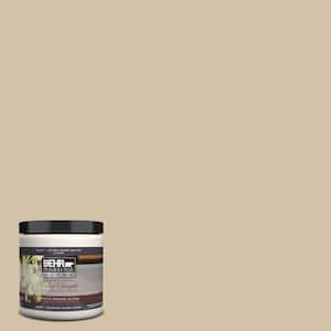
Wheat Bread by Behr
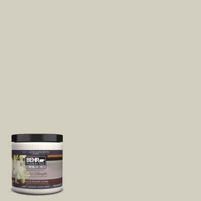
Ocean Pearl by Behr
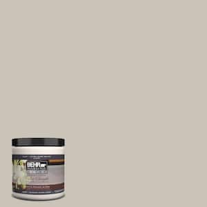
Oat Straw by Behr
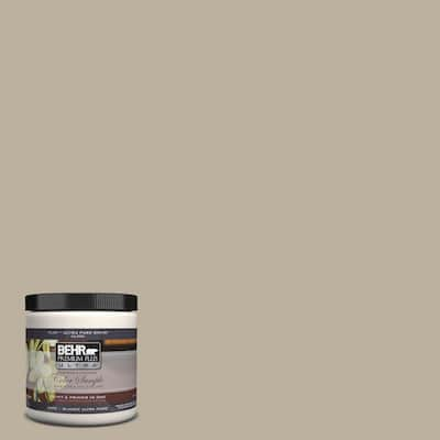
Pebble Stone by Behr
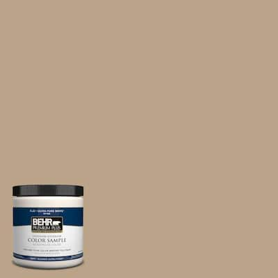
Harvest Brown by Behr
One other color that I would suggest that is not from Behr, but can be color matched, is Kilim Beige from Sherwin Williams. I saw a similar room with almost identical stone and wood that was painted a light green. After many paint samples, Kilim Beige became the chosen color and it looked perfect with the wood and stone. It wasn’t too heavy, didn’t have any crazy undertones, it added warmth and made the room feel bigger.
I hope this gives you a good place to start, Liza. I am anticipating a new room reveal and can’t wait to see what you decide.
Any other suggestions from my awesome and talented readers? What you recommend Liza do?
Thanks so much for your input and have a great weekend!!
Friday, January 10, 2014
2014 Paint Color Trends {Benjamin Moore & Valspar}
Happy Friday everyone! Last month I featured Sherwin Williams color of the year, Exclusive Plum, and wanted to share with you a few more color trends for 2014.
Valspar just released their 2014 color outlook this week and it’s awesome! “In 2014, consumers will be redefining what matters and will feel a growing awareness of what’s important,” said Sue Kim, Valspar color strategist. “The Valspar 2014 Color Outlook draws on this trend, with color palettes that are inspired by how people are purposefully incorporating these redefined experiences into their daily lives.”


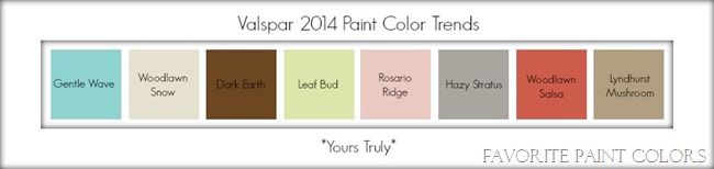
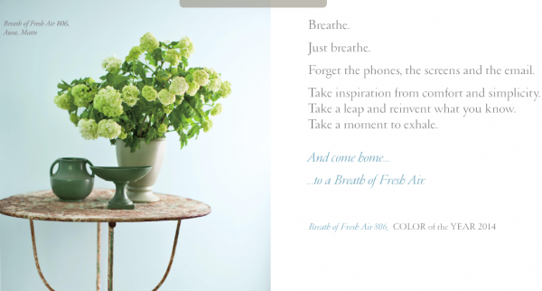


Valspar just released their 2014 color outlook this week and it’s awesome! “In 2014, consumers will be redefining what matters and will feel a growing awareness of what’s important,” said Sue Kim, Valspar color strategist. “The Valspar 2014 Color Outlook draws on this trend, with color palettes that are inspired by how people are purposefully incorporating these redefined experiences into their daily lives.”

“A movement has begun of simplifying our surroundings. Minimalism creates space for new energy. Restoration and balance inspire the Zenergy palette.” – Valspar

“Reconnecting our stories with cultures and customs gone by has begun to influence modern living. Time Traveler puts a modern spin on classic style.” - Valspar

“When imagination and reality collide, something beautifully imperfect happens. A focus on individual expression is at the heart of the Yours Truly palette.” – Valspar
What do you think? Any colors that jump out to you? I love the colors in “Zenergy”. So serene and calming to me.
Have you seen Benjamin Moore’s 2014 colors yet? I love the soft pastels this year.
Also, Behr has come out with their color trends for this year. Click on the picture below to see more inspiration and have a wonderful weekend. So glad it’s Friday!
Monday, December 30, 2013
Aqua Smoke

Aqua Smoke by Behr
Remember my top 10 turquoise paint colors? Aqua Smoke is one of them, and here’s how it looks in this beautiful living room.I feel like it’s been forever since I have posted, but oh how nice the break was last week. Hope everyone had a great Christmas. Looking forward to the New Year with you, my awesome readers! Have a great day!
Wednesday, December 4, 2013
Tuesday, November 12, 2013

Wednesday, October 9, 2013

Tuesday, October 8, 2013
.JPG)
Wednesday, September 4, 2013
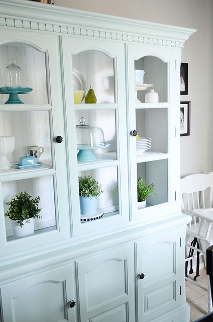 Aqua Smoke by Behr
Wednesday, August 21, 2013
Quiver Tan

Quiver Tan by Sherwin Williams
Cabinet color: Powdered Snow by Behr (matched to Sherwin Williams oil based paint)
Tuesday, August 13, 2013

Thursday, August 1, 2013
Pussywillow and Starless Night

Wall Color: Pussywillow by Sherwin Williams
Coffee Table: Starless Night by Behr
Friday, July 26, 2013


Thursday, June 27, 2013

Wednesday, June 19, 2013

Thursday, June 13, 2013
.jpg)
Thursday, May 23, 2013

Wednesday, May 15, 2013
Castle Path and Garden Wall

Castle Path by Behr (lighter color) and Garden Wall by Behr (darker color)
Friday, May 3, 2013

Subscribe to:
Posts (Atom)