Friday, December 28, 2012
Thursday, December 27, 2012
Whole Wheat
Friday, December 21, 2012
Merry Christmas!

Merry Christmas from my family to yours. I am so grateful for the opportunity I have had to connect with you through this blog and wish you all the happiest of holidays.
Tuesday, December 18, 2012
Healing Aloe
Friday, December 14, 2012
Follow-up to Jenna’s House {paint color suggestions}
Thank you so much for all of your comments and suggestions on Jenna’s home. I think any one of the colors mentioned would look great and would say to anyone in a similar predicament to look at the comments here. There are lots of great suggestions for anyone trying to find a great neutral paint color, particularly one that goes with wood trim or cabinets. I also did a post awhile back with other suggestions on picking out paint colors that go with wood.
This home is great because it’s pretty much a blank slate. So, if this were my home? These are some options that I would look at. Looking at paint decks and trying to match it with pictures can be a lot different than actually trying out samples on the walls. These are just suggestions to look at. :)


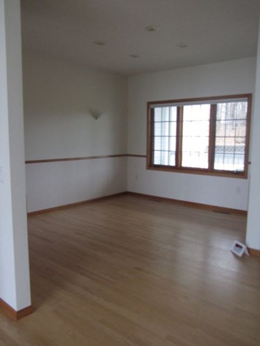

This home is great because it’s pretty much a blank slate. So, if this were my home? These are some options that I would look at. Looking at paint decks and trying to match it with pictures can be a lot different than actually trying out samples on the walls. These are just suggestions to look at. :)

I would start out with the kitchen since it has the most wood. I would get a few neutral paint colors that I love and put them on the wall and see what works the best. Here are some samples I would probably try.
 Kilim Beige by SW Kilim Beige by SW |  Buckwheat Flour Buckwheat Flour |  Putnam Ivory BM Putnam Ivory BM |
 Wheeling Neutral Wheeling Neutral by BM |  Relaxed Khaki SW Relaxed Khaki SW |  Powell Buff by BM Powell Buff by BM |

Pavilion Beige SW
| 
Latte – Restoration Hardware
| 
Blonde by SW
|
Jenna mentioned that she has been looking at Tobacco Road at 50%, which has been a pretty popular color, especially with wood cabinets. I think it’s a great choice. TR 100% is on the top, 50% in the middle and 25% on the bottom.


I would then move on to the dining area and great room. Here, depending on what color I picked in the kitchen, I would go a shade or two darker to give it some more contrast and to add more color to such an open, natural lit room. The wall with the clock on it would be a great breaking point for the dining area.


For this living area, I would probably paint it a different color than the kitchen and great room. Here are some options I woud look at.
Lenox Tan BM |  Wickham Gray BM |  Edgecomb Gray BM Edgecomb Gray BM |
Restrained Gold SW | Ramie by SW |

For the bathroom I think a green/gray color would look nice. Here are some of my favorites, some have a little more blue to them which I like as well.
That is where I would start. I know colors can look one way on the computer or paint chip and totally different on the walls, so the key is sampling. I hope Jenna can find the perfect color she loves. Thank you so much for all of your input and suggestions. You guys are awesome! I hope you have a wonderful weekend!
Thursday, December 13, 2012
Dishwater
Wednesday, December 12, 2012
Oatlands Subtle Taupe
Tuesday, December 11, 2012
Artesian Well
Friday, December 7, 2012
Paint Suggestions: Help From My Readers
The other day I got an e-mail from one of my readers that said this: “I just wanted to let you know I love your blog. I have been using it to try to find the best paint colors (Sherwin Williams) for a new house we bought that- get this- is painted entirely in Dover White 50%! Dover White wasn't white enough they had to cut it to 50% :) My husband and I like neutral colors- especially mostly neutrals with a little color to them. I have attached a few pictures of rooms I need help with- of course with all natural oak trim. Any suggestions from you or your readers is greatly appreciated!”
Today I want to help Jenna out, and would love to hear suggestions from you. What are your favorite neutral colors? Do you have a paint color in your home that you love and might work well in Jenna’s home? I know I have some very talented readers, many of you have let me into your homes through sending pictures and I can’t wait to hear what you suggest.


Today I want to help Jenna out, and would love to hear suggestions from you. What are your favorite neutral colors? Do you have a paint color in your home that you love and might work well in Jenna’s home? I know I have some very talented readers, many of you have let me into your homes through sending pictures and I can’t wait to hear what you suggest.


Have a wonderful weekend! I’ll be back next week with my suggestions and more paint colors!
Thursday, December 6, 2012
Evergreens

I wanted to post this picture of Trina and Mike from a Country Farmhouse because I love the door behind them. Painted “Evergreens” by Sherwin Williams just for the holidays.
Also see Julia’s post over at Hooked on Houses to see more of their beautiful home featured in Country Living magazine last year.
Wednesday, December 5, 2012
Gray Clouds and Rhinestone

Vanity: Gray Clouds by Sherwin Williams (Emerald Line)
Wall Color: Rhinestone by Sherwin Williams (Emerald Line)
Tuesday, December 4, 2012
Sherwin -Williams 2013 Color of the Year
Happy December! I hope that everyone is well and that you are enjoying this holiday season so far.
Today, I want to introduce you to the next Sherwin-Williams color of the year! It’s fresh, serene, adaptable and I think soo 2013.


 What do you think? Do you like it? For me, I could picture it in a bathroom with fun, vibrant colors, a laundry room with white cabinets, or a tween girl’s room with retro décor. Is this a color you would use in your home? If so, where?
Today, I want to introduce you to the next Sherwin-Williams color of the year! It’s fresh, serene, adaptable and I think soo 2013.

Meet: “Aloe”


Jackie Jordan, color expert from Sherwin-Williams says Aloe is “a perfect pick for everyday spaces such as a breezy sunroom or a well-dressed living room,” and calls it “no ordinary pastel”. Jordan says “While Aloe’s vibe can verge on retro, when paired with caviar blacks, crisp whites or soft grays, Aloe has a new soul and attitude.”
Fun, huh?
Also, here is a great pictograph with more ideas on how it could be used in your home or office.

Subscribe to:
Comments (Atom)


