


“I came across your blog in search for the perfect paint color for our living room. We've bought over 20 samples and have even painted it twice. We just can't seem to find the right color.
The color we have on there right now is too dark; it's Mariner by Martha Stewart (Glidden). Our closest store is Home Depot so Behr is our brand of choice. What would you recommend? We want something lighter that ties in the stone and flooring. We have an open floor plan too which opens into our kitchen (another project in waiting).
Any recommendations? Your opinion would be greatly welcomed.”
Sound familiar to anyone? I’m so glad Liza contacted me and sent me her pictures. I love looking at the possibilities of a room and imagining the transformation that a simple paint color can make. Everyone has different tastes and style, but here are a few of my suggestions:
1. Lighten Up: You’ve got a beautiful open space and the more light you have, the more open your room will feel. The first place to start, which you already know, is to lighten up your paint color. If you like the shade you have, but just think it’s just too dark, you could always try colors above your current paint color on the paint deck.
2. Choose Colors From Your Room: If you want a completely different look but you’re not sure where to start, look at the colors that are already in your room. You have tans, beiges, grays, and browns. Pick a tan, beige, etc. that you are drawn to and go from there.
3. Look at Your Color Tones: Look at the tones that come from the room you are painting. Do you want to bring those out, or do you want to subdue them? From this picture, I can see tones from each primary color. I see mostly yellow tones from the stones, some red from the wood, and a hint of blue coming out from some of the darker stone. If you have access to a paint deck from Behr, you can see that the neutrals are divided into three categories: yellow-toned neutrals, red-toned neutrals, and blue-toned neutrals. Personally, I would try and pick from the yellow-toned neutrals to add more warmth and to bring out the “gold” tones from the fireplace. Red-toned neutrals may look too pink in this room and although you have blue on the walls right now, I think the yellow-tones would add more warmth and light, therefore giving your room a more open and airy feel.
Based on those three criteria, here a few samples I have come up with from the Behr paint deck.

Wheat Bread by Behr

Ocean Pearl by Behr

Oat Straw by Behr
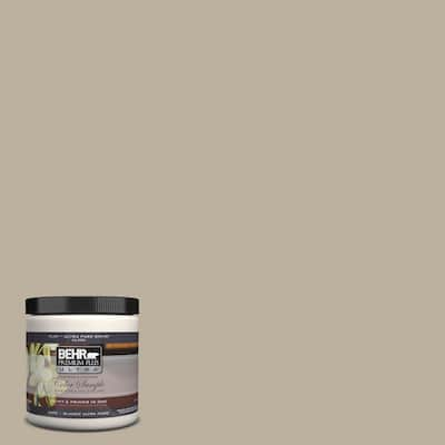
Pebble Stone by Behr

Harvest Brown by Behr
One other color that I would suggest that is not from Behr, but can be color matched, is Kilim Beige from Sherwin Williams. I saw a similar room with almost identical stone and wood that was painted a light green. After many paint samples, Kilim Beige became the chosen color and it looked perfect with the wood and stone. It wasn’t too heavy, didn’t have any crazy undertones, it added warmth and made the room feel bigger.
I hope this gives you a good place to start, Liza. I am anticipating a new room reveal and can’t wait to see what you decide.
Any other suggestions from my awesome and talented readers? What you recommend Liza do?
Thanks so much for your input and have a great weekend!!


Oooh, such great advice. I want to paint another room now. :) Lightening up the space will definitely make a positive difference. My only thought is that there are already a lot of neutral/beige/brown tones in the room from the wood, fireplace, and furniture. Normally I'm not a fan of accent walls, but depending on the layout of the rest of the room, I think having an accent wall with more color might look really good. That's my inexperienced and unqualified opinion. ;)
ReplyDeleteI am no expert, just painted and repainted enough to share my mistakes- I like the idea of the beige, tans that you suggested. I think there isn't enough blue, or gray stone to pull off using a blue paint. She just needs to be careful to stay away from the pink-beiges. Her stone has a lot of yellow-orange undertones so she need the beige to compliment the stone. I also hope she paints the angle part of the wall/ceiling space the same color she paints the walls. Behr can mix paint to match Benjamin Moore colors- I like B.Moore's Bleeker Beige HC-80. It is a grey base with green undertones. Another Benjamin Moore paint is Monroe Bisque HC-26, it has a strong yellow undertones, but not gold looking at all. When I shop for paint, I have started asking for the formula so I can gauge how much red or yellow goes into making the paint. On my computer screen, the colors you selected are very pretty. I didn't mean to high-jack the comments section!
ReplyDeleteMary, from Virginia
Awesome suggestions! Jenny, your living room is one of my absolute favorites and I love the color palette in your home. If anyone hasn't seen it, you definitely need to check it out. And yes, neutrals are not just beiges or tans anymores. There are so many different colors that can act as a neutral and I love that. Claire and Mary, love your suggestions as well. Color can be added in so many different ways, an accent wall is a great suggestion, furniture, home decor, etc. and Mary (from Virginia) your BM suggestions are great and looking at the colors that actually go into the paint formula is an aweseom tip. Thanks for your input gals, you're the best!
ReplyDelete